Accessibility in mobile games: what games can borrow from parrots
Colorblind modes, readable fonts, one-handed controls and design for players 50+. What can mobile games borrow from parrots? Psittacus studio explains.

Published on 7 min
On this page
In 1977 a young African grey parrot was sold at a Chicago pet shop. He ended up with psychologist Irene Pepperberg and, for three decades, held conversations nobody had dared to dream of. Alex named fifty objects, counted to six, and told apart seven colors and five shapes. On the evening of September 6, 2007, Pepperberg said “see you tomorrow” as she put him away for the night. Alex answered: “See you tomorrow. I love you.” He died that same night. His species is Psittacus erithacus, and we named our studio Psittacus because there is a lot to learn from that bird.
When designing mobile games, we focus on four core pillars of accessibility: support for color vision deficiency, comfort for players 50+, ergonomic interface design (UX), and purposeful color palettes. Nature offers surprisingly practical lessons in each of these areas.
Color vision and game board design
Consider a biological fact every game designer should keep in mind: parrots possess four distinct types of cone cells in their retinas, allowing them to perceive light across four channels, including ultraviolet. Human vision, by comparison, relies on only three cone types. Avian plumage reflects intricate UV patterns that remain invisible to the naked human eye, a phenomenon detailed on Wikipedia under tetrachromacy.
Why does this matter for accessibility? It reminds us that an “intuitive” interface is only intuitive to the person who designed it. To someone with color vision deficiency, a game board where critical states differ solely by shades of red and green becomes unreadable. Color vision deficiency affects approximately 300 million people worldwide, including roughly 8% of men and 0.5% of women.
Research shows that color choices directly impact player performance. In an experiment published in Multimodal Technologies and Interaction, players with color vision deficiency required an average of 94 seconds to complete a puzzle level, compared to 81 seconds for players with typical vision. More importantly, those who struggled with color distinction reported noticeably lower engagement and satisfaction. Accessibility is not simply about whether a level can be completed; it is about whether the experience feels welcoming.
Key takeaways for mobile designers include:
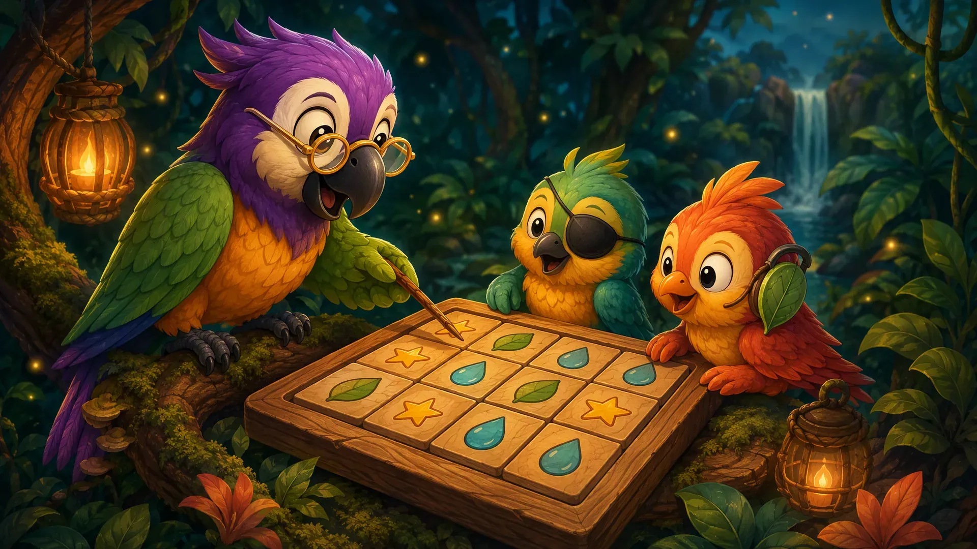
- Never convey vital gameplay information through color alone. Always pair colors with distinct shapes, borders, or symbols.
- Maintain a text contrast ratio of at least 4.5:1, following WCAG guidelines.
- Include colorblind options from the outset by verifying palettes in vision simulators.
- Test directly with diverse players rather than relying on theoretical assumptions.
Players 50+ are an essential audience
Video gaming is increasingly multigenerational. In the United States alone, over 52 million people aged 50 and older play video games, according to research by AARP. This demographic has grown by 12 million players since 2016, with 84% choosing smartphones as their primary gaming device.
Yet 69% of older gamers report feeling that modern games overlook their needs, often presenting tiny fonts, cramped touch targets, or stressful timers. Players over fifty frequently play in short intervals - during a commute, over morning coffee, or between daily errands. They appreciate readable boards, straightforward navigation, and the freedom to undo an accidental tap without penalty.
Our accessibility standards for inclusive design include:
- Clear, legible typography scaled appropriately for bright daylight conditions.
- High contrast ratios adhering to WCAG standards, avoiding faint gray text on muted backgrounds.
- No countdown timers in core game modes, allowing players to solve at their own pace.
- Generous touch targets (at least 9.2 mm) to prevent accidental taps during one-handed play.
- Unambiguous visual feedback explaining why two numbers or tiles conflict.
At Psittacus, our goal is for players to conclude each session feeling relaxed and accomplished. A logic puzzle should offer peace of mind, not frustration.
Simple mechanics and one-handed ergonomics
Usability pioneer Don Norman observed that well-crafted design feels almost invisible. Players concentrate on solving the puzzle while the interface stays out of the way. Reaching that level of effortless interaction requires deliberate planning.
Most mobile users operate their phones with one hand. In field research observing 1,333 mobile users, UX designer Steve Hoober found that 49% of people hold and navigate their phone with a single hand, predominantly using their thumb. For game developers, the lesson is clear: primary interactive controls belong in the bottom half of the screen within the thumb’s natural sweep. The top half is better reserved for viewing the board.
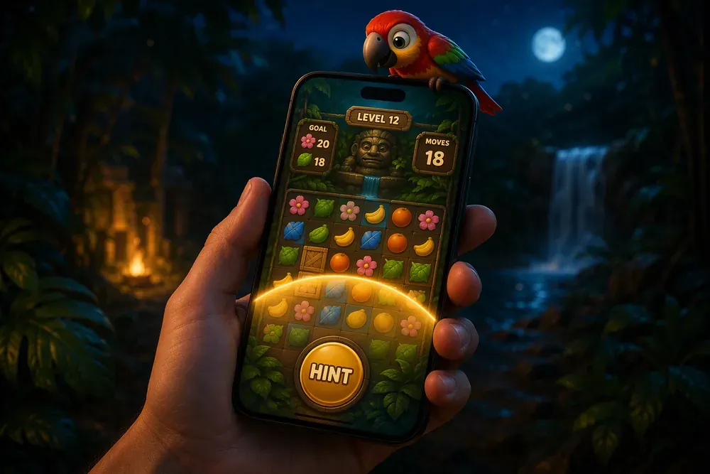
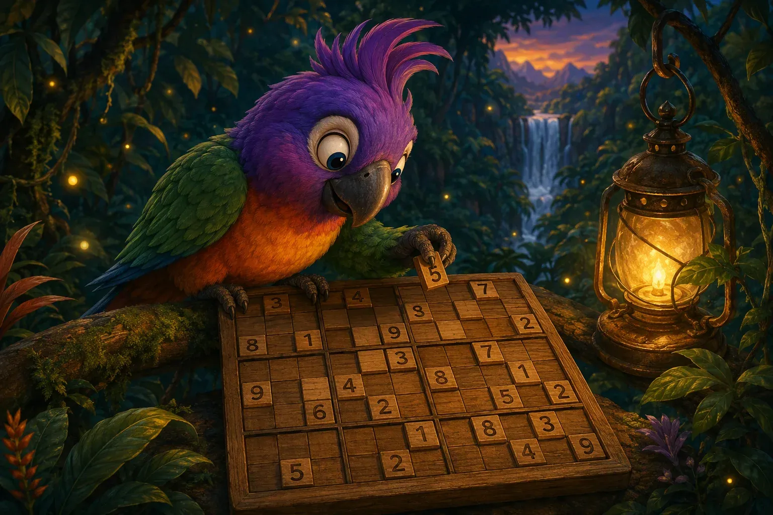
Creating an intuitive experience requires editorial restraint. Each screen should carry one clear function. If a mechanic requires an extensive tutorial to explain, the design itself needs simplification. We apply this principle throughout Polydocu, our jungle sudoku adventure: the board is immediately legible, while progression unfolds along the saga map.
Color palettes as cohesive visual systems
An effective color palette is not an arbitrary assortment of attractive shades, but a structured visual hierarchy. It establishes contrast, tone, and functional roles. The classic 60/30/10 design rule applies well to mobile games: a dominant background shade sets the atmosphere, a secondary hue defines the board and key surfaces, and an accent color is reserved for elements that require immediate attention.
When developing color schemes for mobile play, three questions guide our choices: What mood does the opening screen convey? Which colors represent interactive mechanics versus decorative background? Does the board remain legible at night or in bright outdoor sunlight? In Polydocu, the deep jungle background provides comfortable contrast for warm, glowing grid tiles.
Nature reinforces this lesson: even birds capable of ultraviolet vision never rely on color as an isolated signal. Color in the wild is always paired with shape, motion, or sound.
Mobile game accessibility checklist
A summary of core accessibility best practices for mobile puzzle games:
| Barrier | Affected audience | Design solution |
|---|---|---|
| Color-only indicators | Players with color vision deficiency | Add shapes, outlines, or icons |
| Low visual contrast | Seniors, bright outdoor lighting | Maintain at least 4.5:1 text contrast |
| Small interactive targets | One-handed mobile users | Ensure touch targets meet 9.2 mm minimum |
| Timed pressure | Players seeking relaxing focus | Provide untimed, casual play modes |
- High text contrast (minimum 4.5:1) across all interface elements.
- Dual-coding with shape and color for all vital game states.
- Comfortable touch targets measuring at least 9.2 mm.
- One-handed ergonomics, keeping primary actions within the thumb zone.
- Visual cues for sound effects essential to puzzle solving.
- Untimed gameplay modes that allow players to solve at their own rhythm.
- Playtesting with diverse audiences, including older adults and players with disabilities.
Frequently asked questions
What is a colorblind mode in a game?
It is an alternative color scheme that ensures all game states and hints remain distinct without relying exclusively on difficult-to-distinguish hues, often reinforced with icons or patterns.
How common is color vision deficiency?
Approximately 300 million people worldwide live with color vision deficiency, representing roughly 8% of men and 0.5% of women.
What is the recommended touch target size on mobile?
Interactive buttons should measure at least 9.2 millimeters to prevent input errors during one-handed use.
Do older adults actively play mobile games?
Yes. In the United States alone, over 52 million people over 50 play video games regularly, with 84% choosing mobile devices.
Looking ahead
At Psittacus, we believe great mobile games combine engaging mental challenges with genuine respect for player comfort. Our debut title, Polydocu, turns classic sudoku into an expedition through the jungle, accompanied by Poly the parrot. If you would like to experience this approach firsthand, join our waitlist to play when we launch. We also invite you to explore our reflections on timeless mobile game design and our 7 rules for mobile game UX design.
Sources
- Irene Pepperberg and the story of Alex: Wikipedia, “Alex (parrot)” and Audubon, “How Irene Pepperberg Revolutionized Our Understanding of Bird Intelligence”
- Study on color blindness and player engagement: Multimodal Technologies and Interaction, 2025
- Color vision deficiency numbers: RGBlind, “Color Blind Gaming Guide”
- Contrast guidelines: W3C WCAG 2.2, Success Criterion 1.4.3 and MDN, “Color contrast”
- Data on 50+ gamers: AARP, “Discover How Video Games Benefit Older Adults” and AARP, “Why Video Games Click With People 50-Plus”
- Kea intelligence and tool use: CORDIS, European Union
- Kea and touchscreens: University of Auckland, 2021
- Kākāpō: Natural History Museum and Earth.org
- Designing for thumbs: Scott Hurff, “How to design for thumbs” and the study “One-handed thumb interaction of mobile devices”
- Color theory in game production: Nasty Rodent, “Color Theory for Game Art”
- On UX with the field’s pioneer: Adobe Blog, interview with Don Norman
- Practical accessibility guidance: Game Accessibility Guidelines
Designing games for real people, with genuine care
Large digits, reliable contrast, easy one-handed play, and a palette built for color vision deficiency: these are design principles we hold Polydocu to from day one. Join the waitlist to stay updated.
One email at launch, no spam.