
Mobile Game UX Design: 7 Rules for Crafting Player Experience (GX)
How to design onboarding, the thumb zone, 3-minute sessions, and retention in mobile games? 7 UX/GX rules from Psittacus backed by research.

Published on 12 min
On this page
You stand on a crowded tram: one hand holds the grab handle, the other balances your phone. Your stop is three minutes away, and you just launched a newly downloaded game. If the core interaction does not hook you on the very first screen, you will close the app and return to scrolling your social feeds.
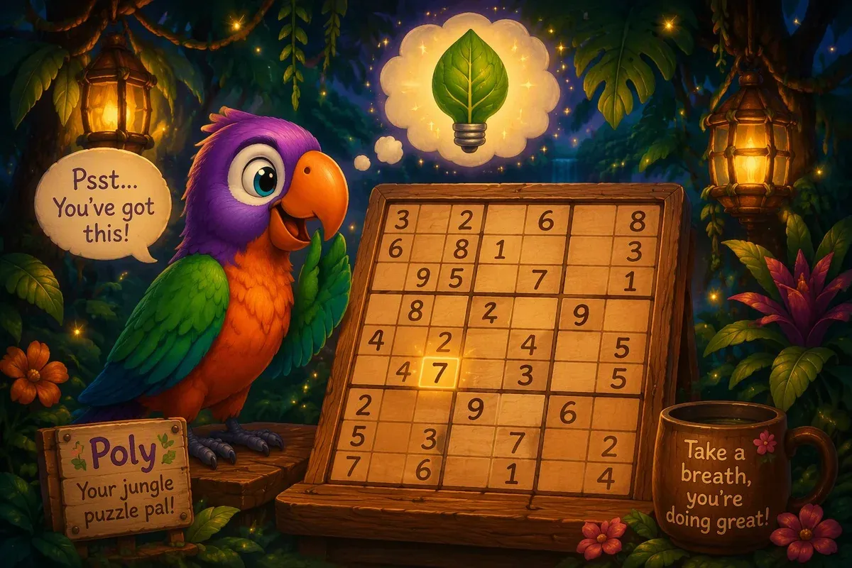
This commute scenario defines how mobile games are consumed. It is why user experience (UX) and game experience (GX) must be designed before building levels or producing polished assets. The audience is massive: according to the GameTrack 2025 report, Poland alone counts 15.9 million players, and mobile titles generate the largest share of industry revenue. With that scale comes intense competition for player attention. In this article, we outline seven core UX and GX principles we apply to Polydocu, our sudoku adventure featuring Poly the parrot, showing how research in ergonomics and psychology translates into practical game design decisions.
1. Why the first 60 seconds decide everything (onboarding)
Industry retention benchmarks highlight a difficult reality. Across mobile titles, median Day 1 (D1) retention hovers around 20-25%, and drops to roughly 4% by Day 7 (GameAnalytics data reviewed by AppFollow). Three out of four players abandon a title within the first twenty-four hours, and that decision is usually made during their opening session. Onboarding cannot serve as an introductory chore before the real fun begins. On mobile devices, onboarding is the game.
We follow three practical rules during first-time player onboarding:
- Playable mechanics over passive reading. The player should engage with the core fun within the first 60 seconds. Account registration forms, push notification prompts, and text screens stall momentum. Mobile industry veterans emphasize this principle: the first session must deliver the core loop promise immediately, rather than trying to explain every peripheral system at once.
- Learning through action. Interactive introductory boards teach rules far more effectively than static instruction screens. In Polydocu, the opening sudoku puzzle guides the player directly: one missing number, one empty cell, and an immediate sense of accomplishment. When a game mechanic requires a multi-page tutorial, the interaction model itself needs simplification.
- An early sense of competence. During the opening session, players do not need deep metagame economies or hundreds of coins. They need the psychological reassurance that they understand the rules and can succeed. A Finnish study on free-to-play mobile retention confirmed this dynamic: refining the first-time user experience improved D1 retention more reliably than later changes.
Tracking time-to-first-reward as an independent product metric helps game teams identify friction early. Once you measure the exact seconds from app launch to the first rewarding moment, you can actively reduce that gap.
2. One hand, one thumb: designing for a phone on a tram
In his field research observing 1,333 mobile phone users in public spaces, Steven Hoober categorized device grips into three primary behaviors: 49% one-handed, 36% cradling (one hand supports while the other interacts), and 15% two-handed. When factoring in thumb usage across all grips, the thumb drives approximately 75% of all mobile touchscreen interactions. Players constantly shift their grip to match their physical environment, which means an interface that demands a permanent two-handed hold quickly creates physical strain.
Designing for comfortable one-handed use requires clear ergonomic priorities:
- Place core controls in the thumb zone. Primary actions, such as selecting a digit, undoing a move, or opening a hint, belong in the lower half of the screen within the natural sweep of the thumb. The upper corners should be reserved for passive status indicators that do not require frequent interaction.
- Generous touch targets. When riding public transit, vehicle movement degrades motor precision. In Polydocu, number tiles and action buttons provide ample surface area, allowing players to tap accurately with a thumb without careful aiming.
- Taps over complex gestures. In a logic puzzle, a simple tap is far more dependable than dragging or multi-finger inputs. As demonstrated in classic mobile thumb zone mapping, UI elements placed away from the bottom center edge require significantly more physical effort to reach.

3. The 3-minute session: designing for short breaks
Player habits on mobile devices differ substantially from desktop or console play. Among the top 25% of mobile games, an average session lasts around 5 minutes and repeats 5 to 6 times per day. Data from Mistplay also shows that 85% of mobile players open their favorite games multiple times a day. Mobile play fits into everyday micro-windows: waiting for coffee, riding between stops, or standing in line.
Designing for these short sessions involves specific architectural choices:
- Instant loading and frictionless exit. Launching a title should take only a few seconds, and closing the app must never discard current progress. Sudoku offers a major advantage here, as the board state saves automatically after every input, allowing players to step away and resume without penalty.
- Meaningful progress within 3 minutes. Every brief play session should complete a clear loop, whether that means filling a challenging quadrant, finishing a daily quest, or earning a star. This structure gives players a feeling of closure even during quick breaks.
- No punishment for interruption. Games that penalize players for locking their phones or stepping away create irritation rather than genuine commitment. Mechanics should adapt to the player schedule instead of demanding rigid availability.
In Polydocu, the entire experience functions offline without requiring a constant network connection. This ensures a relaxing puzzle session remains accessible in low-connectivity settings such as subway trains or airplanes.

4. How to measure “fun”, not just retention
Retention rates prove that a player returned to an app, but they cannot reveal the emotional quality of that return. When designing mobile player experience, satisfaction and genuine fun belong alongside retention as primary success metrics. At Psittacus, we combine three complementary sources of feedback:
- Structured post-session surveys. The Game Experience Questionnaire (GEQ) measures critical dimensions of gameplay, including immersion, flow, perceived competence, and tension. Similarly, the PENS framework is grounded in self-determination theory, assessing player autonomy and relatedness. A brief questionnaire conducted after playtesting offers qualitative depth that usage dashboards cannot capture alone.
- Behavioral telemetry. As early as 2005, Nicole Lazzaro and Larry Mellon discussed behavioral engagement indicators for games (detailed on GameAnalytics). When telemetry shows that players repeatedly restart a specific puzzle or drop out at an identical progression milestone, the data flags an unaddressed difficulty spike. Telemetry pinpoints where players encounter trouble, while player interviews explain the underlying causes.
- Emotional motivation models. Nicole Lazzaro’s 4 Keys 2 Fun framework organizes gameplay satisfaction into four categories: Hard Fun (mastery and challenge), Easy Fun (curiosity and exploration), Serious Fun (meaningful accomplishment), and People Fun (social interaction). Thoughtful game design balances these emotional drivers across chapters, preventing repetitive puzzle fatigue.
Academic research into psychological flow (such as studies on skill-challenge balance in mobile puzzle games) confirms that balancing difficulty alone does not guarantee player enjoyment. For this reason, quantitative telemetry must be paired with qualitative user conversations to understand player emotions fully.

5. Daily rewards: building a habit or breeding fatigue
Daily login rewards remain one of the most widely adopted player retention mechanics in mobile gaming. Their psychological effectiveness draws heavily on the loss aversion principle documented by Kahneman and Tversky: the pain of losing an established streak is experienced roughly twice as intensely as the pleasure of gaining an equivalent prize. After several weeks of consistent play, a daily streak becomes an emotional investment that players want to preserve.
Distinguishing between healthy player routines and gameplay fatigue requires careful calibration:
- Escalating rewards outperform flat bonuses. A progressive calendar where Day 7 delivers substantially greater value than Day 1 establishes a clear objective for the week. In contrast, flat bonuses quickly become unremarkable and lose their motivational appeal.
- Streak protection mitigates unnecessary frustration. Streak freeze mechanics, popular in products like Duolingo, protect players from losing weeks of accumulated progress due to a single busy day. Removing catastrophic failure maintains daily engagement without turning the game into a source of stress.
- Avoiding hollow retention. When maintaining a streak overtakes actual enjoyment of the game, players log in solely to claim a reward and immediately quit. This hollow engagement pattern is well documented in industry analyses of Duolingo gamification. While it produces inflated daily active numbers, it fails to foster genuine game appreciation.
In Polydocu, daily puzzles are designed to be concise, balanced, and solvable in just a few minutes, serving as a welcoming invitation rather than an obligatory chore.

6. The art of failure: designing a loss that invites a retry
In his book The Art of Failure (MIT Press), Jesper Juul analyzes a central paradox of video games: players voluntarily choose an activity where failure is frequent, yet derive substantial pleasure from the experience. This engagement holds true when a game feels fair and provides an immediate path to redemption. Failure motivates players when its cause is transparent and its cost is minimal.
This concept translates into four design principles:
- Immediate clarity on cause of failure. Players must immediately understand why an action was invalid. In sudoku, conflicting digits in a row or column provide instant, neutral feedback rather than an arbitrary punishment.
- Negligible penalty and instant restart. A mistake should not erase substantial previous effort. Providing an instant retry option with a single tap keeps players immersed in the problem-solving flow without lingering on discouraging game-over screens.
- Near-miss dynamics over crushing defeat. Failing a board with 90% of the cells solved naturally invites another attempt because the goal felt attainable. Conversely, confronting a severe difficulty wall early in the game prompts players to uninstall the app.
- Encouraging presentation tone. Mistakes do not need dramatic visual reprimands. In Polydocu, Poly the parrot offers gentle encouragement when an error occurs, framing each attempt as a normal step in mastering logic puzzles.

7. Do players like hints? Designing a hint system
Assistance systems in puzzle games present more design nuance than is often acknowledged. In a study documented by the University of Washington on adaptive hint systems, 66.3% of 108 surveyed students felt that existing hint systems suffered from poor timing or unhelpful formats. Research by Wauck and Fu at UIUC revealed that automated algorithms often trigger prematurely, interrupting the player’s own cognitive process. A hint delivered too early spoils the satisfaction of problem solving, while one delivered too late causes unnecessary frustration.
These findings guide three implementation principles for mobile hint systems:
- Player control comes first. The primary hint mechanism should always be on demand, triggered deliberately by the player. Automated assistance should only intervene after prolonged inactivity, ensuring the player is genuinely stuck.
- Progressive levels of guidance. An effective hint does not give away the final answer immediately. Instead, it directs player attention toward a specific problem area (such as “inspect the center 3x3 box”). Subsequent requests can then provide more explicit guidance. Research from the University of St Andrews on player guidance in puzzle games confirms that stepped hints resolve deadlocks without stripping away the joy of deduction.
- No punitive barriers to assistance. When hints are locked behind steep currency costs or forced video advertisements, struggling players are more likely to close the app than pay the fee. In Polydocu, hints are readily accessible and structured as supportive learning aids for solving challenging boards.
The GX designer’s checklist
Key evaluation points to verify before releasing a mobile game update:
- Time-to-first-reward in the opening session is measured and minimized
- Essential controls sit comfortably within the thumb zone with generous touch targets
- A 3-minute session delivers a complete, satisfying gameplay loop
- Player enjoyment is evaluated through surveys (GEQ/PENS) and interviews, not retention alone
- Daily rewards escalate progressively and provide streak protection
- Failure states offer clear feedback, low penalties, and single-tap retries
- Hints operate on demand and deliver layered assistance without spoiling solutions
Frequently asked questions
What is the difference between UX and GX in mobile games? UX (User Experience) covers the ergonomic and technical usability of the application, including touch targets, menu navigation, and layout clarity. GX (Game Experience) addresses the emotional and interactive layer of play, including flow, mastery, challenge balance, and decision satisfaction. Both must align closely for a game to feel intuitive and enjoyable.
How long should mobile game onboarding last? Onboarding should be as rapid as possible. Modern mobile design practice recommends introducing playable core mechanics within the first 60 seconds and providing the first rewarding achievement during session one. Exact benchmarks should be validated through direct user playtesting.
Do daily rewards reliably improve player retention? Yes, provided the rewards scale across consecutive days and include protection against accidental streak breaks. Flat daily bonuses lose appeal quickly, while harsh streak penalties create player fatigue rather than sustainable habits.
What is the best way to evaluate player fun? Evaluating enjoyment requires a combination of methods: structured questionnaires (such as GEQ or PENS) following test sessions, telemetry tracking where players pause or abandon play, and direct qualitative interviews with testers.
Sources
- GameTrack 2025 report (Nowy Marketing, Polish)
- AppFollow: Mobile Game Retention 2026
- GameGrowthAdvisor: Retention Strategies 2026
- UXmatters: How Do Users Really Hold Mobile Devices?
- Smashing Magazine: The Thumb Zone
- A List Apart: How We Hold Our Gadgets
- GameAnalytics: Measuring Player Experience
- Game Experience Questionnaire (questionnaire repository)
- Johnson et al.: validation of PENS and GEQ
- Nicole Lazzaro: The 4 Keys 2 Fun
- Jesper Juul: The Art of Failure (MIT Press)
- He, Zhu, Cai: An Adaptive Hint System for Puzzle Games
- Wauck, Fu: A Data-Driven Approach to Hint Design
- University of St Andrews: Effective player guidance in logic puzzles
- Atay Games: Mobile Gaming Statistics 2026
- Why Duolingo’s Gamification Works (dev.to)
Written by the Psittacus team (Poznań, Poland). Read more about our first game on the Polydocu page.
We design for the thumb, the short session and the next round
Onboarding that needs no manual, a layout that suits one hand, sessions that fit a commute, and rewards that bring players back without pressure: these are the rules we test first in Polydocu. Join the waitlist to play at launch.
One email at launch, no spam.